Just writing an essay about the Bauhaus.... and this gentleman knows everything about a good design..... enjoy!
Dieter Rams: ten principles for good design
Tuesday, April 12, 2011


hand- made book
As the second brief we got a project for a hand-made book.
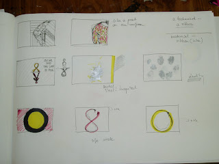
As always I started with a mind map and some notes/ sketches. I decided to illustrate (if one can say that...) Oscar's last 12 days of life. His life was represented by 12 pencils, getting shorter and shorter every day. Then, I wrote a sentence on each of them, representing a summary of the particular day described in the book. I matched the mood of each day with the colour- hence the different colours of the type and pencil endings. I used simple materials- cardboard, wood and piece of aluminium to give the colder, hospital feeleing.


As always I started with a mind map and some notes/ sketches. I decided to illustrate (if one can say that...) Oscar's last 12 days of life. His life was represented by 12 pencils, getting shorter and shorter every day. Then, I wrote a sentence on each of them, representing a summary of the particular day described in the book. I matched the mood of each day with the colour- hence the different colours of the type and pencil endings. I used simple materials- cardboard, wood and piece of aluminium to give the colder, hospital feeleing.


book cover
So,the book cover project.....pretty exciting, isn't it?? After all the initial research, it was time to start working on the paper- brainstorming, thumbnails, colours, concepts....


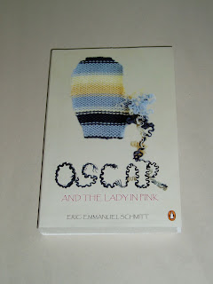
Oscar sharpens the pencil writing the letters, the pencil is shorter everyday, like Oscar's life....

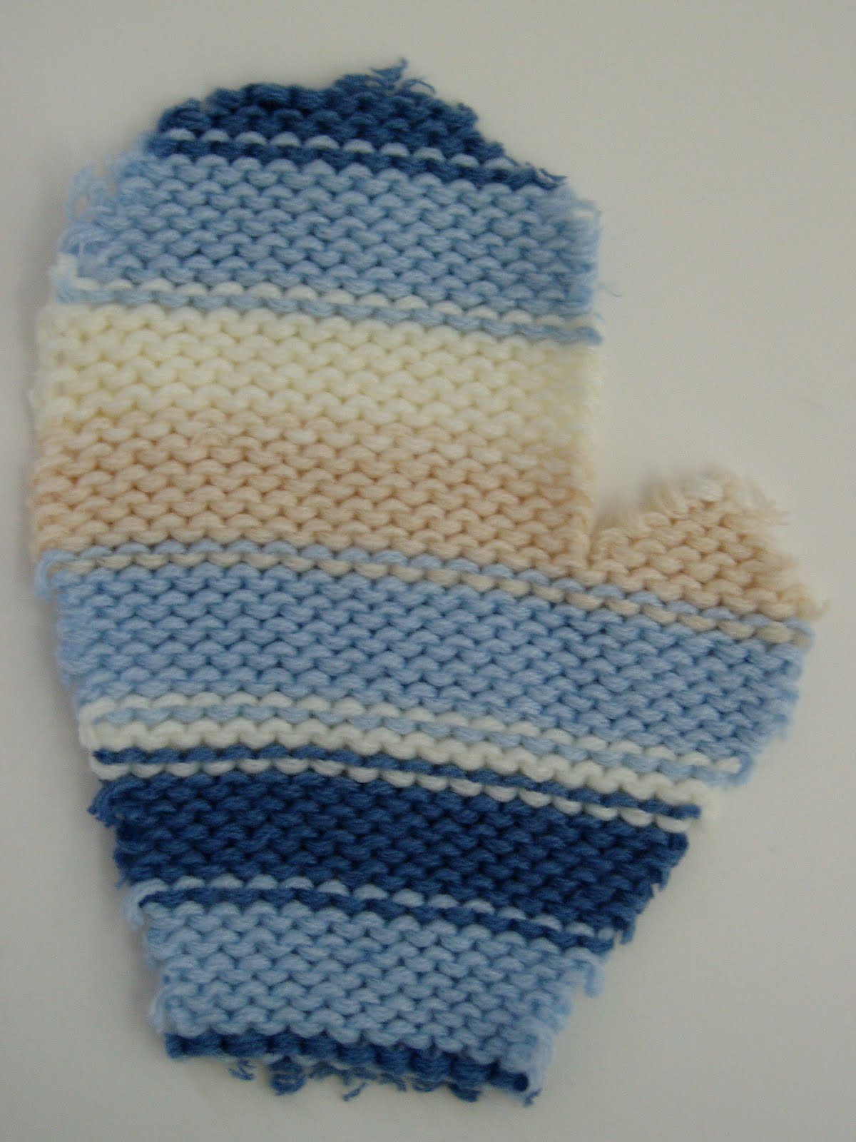
It is winetr time. I imagine, when going for walks, Oscars would wear the mittens. Mittens made of wool, starting to unravel, like Oscar's life....

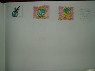
Finally, I decided to go with the glove concept as it communicated that the book is about a child, that there is something wrong going to happen. At the same time it's calm and peaceful, in a way vulnerable......
It took me a while to have it all done in photoshop- starting with getting the material for the glove itself, cutting it to the shape, taking photos.... Then working with the images- changing them, cropping..... layout of the cover (we were working to the Penguin book layout). The other tricky part was to find the proper typeface to go with the mood of the book- child-like (Oscar) but grown-up and spiritual at the same time (Granny Rose). Eventually, for Granny Rose I used the 'Papyrus' font and for Oscar I made the letters from the unravelling wool- it worked as a whole and was directly linked to Oscar. I also used 'Segoe Print' for the book description and the reviews on the back cover.


At the end I had a few ideas how I'd like my book cover to look like, it was just a case of presenting them in..... photoshop. I've never used that programme! And was expected to have the ideas executed within few days..... I don't remember when was the last time I spent so much time in front of the computer. These were the first attempts to get the grasp of it.
Oscar writes letters everyday. Granny Rose encouraged him to do so....

Oscar sharpens the pencil writing the letters, the pencil is shorter everyday, like Oscar's life....

It is winetr time. I imagine, when going for walks, Oscars would wear the mittens. Mittens made of wool, starting to unravel, like Oscar's life....

Finally, I decided to go with the glove concept as it communicated that the book is about a child, that there is something wrong going to happen. At the same time it's calm and peaceful, in a way vulnerable......
It took me a while to have it all done in photoshop- starting with getting the material for the glove itself, cutting it to the shape, taking photos.... Then working with the images- changing them, cropping..... layout of the cover (we were working to the Penguin book layout). The other tricky part was to find the proper typeface to go with the mood of the book- child-like (Oscar) but grown-up and spiritual at the same time (Granny Rose). Eventually, for Granny Rose I used the 'Papyrus' font and for Oscar I made the letters from the unravelling wool- it worked as a whole and was directly linked to Oscar. I also used 'Segoe Print' for the book description and the reviews on the back cover.


the cover itself- getting there!


the finished version ;)


Subscribe to:
Comments (Atom)